If you’re still seeing this page, it means that your bookmarks are out of date.
The new, improved, and redesigned site is here:
If you’re still seeing this page, it means that your bookmarks are out of date.
The new, improved, and redesigned site is here:
First, the NHL Logo Redesign Competition update:
Here are the jerseys in my collection that are up for the prize (along with a $50 gift card). You get to choose ONE of these jerseys if you submit the winning redesigned logo. So far Sean Cox Tattoo is the front-runner … mostly because he’s the ONLY-runner! These are all replica jerseys. If you need size and tag info, shoot me an email. Teams: Predators, Bruins, Hurricanes, Avalanche, Oilers.

The other bit of info I’d like to share is that PuckDrawn.com is undergoing a bit of a redesign. All of the changes are happening behind the scenes and over on the TypePad blogging service. I’m currently blogging with WordPress.com and the limitations are buggin’ me, so it’s time for a change. So far the new design looks nice and clean and am lookin’ forward to unveiling it. A lot more options for interactivity with my readers, so that’s cool. And I’m always lookin’ for ideas, so if there’s something you’d like to see as a more common feature on PuckDrawn, let me know.
I’m also looking forward to Monday’s blog post. I wouldn’t say it’s a forced controversial issue, but one that I am curious what you guys/gals think about it. Be sure to come back on Monday when I’m not being Vinny Vague.
One last thing: If you notice in the photo of the jerseys, you’ll see some skateboards. My brother does skateboard art, so if you’re interested in that type of thing, I’ll hook you up with him.
Posted in jerseys, NHL Logo Redesign Competition
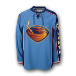
It’s no secret that I dislike the color baby blue (powder blue) for hockey jerseys, BUT there’s one possible monkey in the wrench: The Quebec Nordiques.
I’ve never considered the Nords jersey to be baby blue, but it’s close. However, looking for examples online is a bit difficult. There are many different shades of blue for the Nordiques jersey. Which is correct?
I don’t know my Nordiques uniform history, so it’s possible that they have played with different shades of blue over the years.
If you look at these images side by side, one thing stands out: The Penguins jersey is DEFINITELY baby blue. The Nords? Maybe not.

What do you think? Would you classify the Nords jersey as baby blue?
Posted in Quebec Nordiques | Tags: Quebec Nordiques
Well, my Flyers have been knocked out of the playoffs by a Pittsburgh team that got lucky. As usual, I can’t watch hockey until the next round. That’s how I mourn. So, I’m miserable and now have time to focus on annoying jerseys and logos. Here’s my Top 10 Annoying Jersey and Logo Design Features list:
 |
#10 Hockey Stick in Logo We get it … You’re a hockey team. |
 |
#9 Black Jerseys No matter how hard you try, you’re not pullin’ off the Oakland Raiders tough uniform. Let the black die, so we can all switch to bitching about the forced “retro” circle logos. |
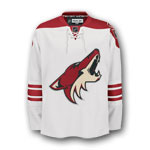 |
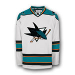
#8 Phoenix Coyotes Seriously … Have they EVER gotten anything right? |
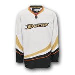 |
#7 Wordmark Crest It’s no surprise that the Ducks are on this list. They, like the Phoenix Coyotes, can’t get any design right. Is it so hard to come up with a crest design? Oh, and cool 1990’s swooshies, dudes. |
 |
#6 Forced Retro I got a feeling that this circle “retro” logo design will become a wide-spread disease like the black jerseys – or swine flu! I hear that the Panthers may be trotting one out next year. Sad. |
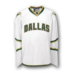 |
#5 City Name on Jersey This one really bugs me. I gotta figure that the people who decided that a city name had to be on a jersey because – you know – fans are just too damn dumb to figure out where they’re from. Do they assume that the city name wouldn’t be on the ticket, the scoreboard, on the Internet, in the newspaper, in the game-day program, etc.?? Dallas is the worst offender, but I’m also lookin’ at you, Vancouver. |
 |
#4 Vertical Piping The traditionalist in me doesn’t like this design at all. I like thick horizontal stripes. I relate thick to strong and thin to weak. No need for thin stripes on a hockey jersey. It also looks more like a practice jersey than a game jersey. I like the Reebok Edge cut and style, but don’t like a lot of the design schemes that Reebok seems to be forcing on teams. |
 |
#3 Nicknames Anything worse than fan-created nicknames for their team? Yes, there is … putting that nickname on a professional team jersey. I can’t imagine the Flyers having “Fly-boys” written in some lame font, angled up or down their jersey. Let’s hope this is not a trend. |
 |
#2 Balance be damned One of the rules of good design is balance. I guess the movers and shakers in the Thrashers’ art department forgot about that when they designed this jersey. Hey, if you hadn’t noticed you were playing a team from Atlanta, they thoughtfully placed the city name on their left sleeve. How thoughtful and terribly out of balance. Perhaps they’ll re-introduce Cooperalls and have “Thrashers” down the right pant leg. |
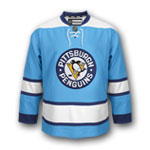 |
#1. Baby Blue Yes, I know Penguins fans think that baby blue is adorable, but you simply can not go out on the ice, play a tough sport like hockey, and wear a baby blue uniform. The Penguins will never win a cup in these things … and if they do, they will be doing some Stalin-like Photoshopping so the history books will show them as wearing black and Vegas gold! (I’m never gonna stop hammering them for this baby blue jersey! haha. All in good fun, people.) |
The 2010 AHL All-Star Game will take place in Portland, Maine. The logo for the event has also been revealed. It’s an ok logo, but that small text will probably look like garbage on a patch!

Posted in AHL | Tags: AHL, All-Star Classic
Well hello everyone. Happy Monday. I’m back from tour, refreshed, and ready to get back to PuckDrawn business!
First off, a bit of news. Turns out that the awesome nhluniforms.com will become even awesomer in the next couple of weeks. A full site redesign and it sounds like it’s gonna be pretty …uh… awesome! Here’s what Andrew Greenstein, the nhluniforms.com founder, has to say about it:
Yes, it’s true — I am doing a complete and total redesign of nhluniforms.com. I’m not going to give too many details — I want to keep it a surprise until launch day, which I hope will be sometime next month. I’ve been working day in and day out on it — staying up long hours in many cases. Trust me, I think you will be floored by what you will see in the coming weeks.
I do, however, need to make a very important clarification. Someone alluded to something I said in the FAQ section on the site about how I do the illustrations, and I said that I drew everything — templates, letters, numbers, logos — by hand in MS Paint. That was actually true in the ORIGINAL version of the site that I did back in 2002. In later versions, including the one I’m working on right now, I took the logos from various sites on the Internet, adjusted the colors to blend in with the shades I use for each jersey, size them in correct proportion, and place them onto the jersey. So, no, I am no longer hand-drawing each logo. I should have changed the FAQ section on the current site (it will be retired when the new site is launched). I hope this clarifies things a bit.
In any event, I’m looking forward to releasing the new site in the next few weeks. And I’m also working on an iPhone version. Anyone here skilled in Apple Xcode?
I’m looking forward to the launch of the new and improved website.
—–
Here’s a couple of logo rebrands by SeanCoxTattoo for the NHL Logo Redesign Competition.


Posted in main
I’m back from tour. Holy shit.
I’ll have regular updates again starting later today – after I nap!
Here are some links to check out to hold you over.
Sports Designer Spotlight: Skye Design Studios
Sports Designer Spotlight 2: Torch Creative
And don’t forget to sign up at the new PuckDrawn forums over at FaceOffBoards.com!
Posted in main
Another fine piece by SeanCoxTattoo. The first official entry in the NHL Logo Redesign Competition. I know this will cause some (a lot of) people in Buffalo to go ape-shit. We all know how bad they want their original logo back. I’d actually – ya know, for a goof – like to see a “slug” redesign.

Posted in main
SOURCE: edmontonjournal.com
The Edmonton Oilers unfortunately can’t turn back the clock and put Wayne Gretzky and Mark Messier in those orange-and-blue jerseys.
But retro is back, and in a big way.
The Oilers will change their home look for the 2009-10 season, playing 27 times in the orange-and-blue from their glory days. The copper-and-blue will only be worn 14 times at Rexall Place.
“The dark blue will become our third jersey, as was Todd McFarlane’s former design (blue and silver with the gears on the sweater),” said Oilers president and CEO Patrick LaForge. “The road whites will stay the same.”
Maybe the Oilers should wear the whites home and away. They were considerably more dangerous away from Rexall this past season.
Posted in Edmonton Oilers | Tags: Edmonton Oilers

We are pleased to announce that we are part of the FaceoffBoards.com community. Click the banner and visit the PuckDrawn.com section: The Design of Hockey.
Here are some pretty cool old-timey hockey jerseys from ebbets.com.
From UniWatchBlog:
Ethan Ganot notes that the Milwaukee Admirals wear some very odd two-tone socks. … Pretty cool how Simeon Varlamov’s mask features the Hershey Bears logo on one side and the Caps logo on the other (as pointed out by Al Stone).
Pretty funny write up on fiercer logos over on ESPN.
Posted in main
